A Place Called Home
Brand Identity & Guidelines
-
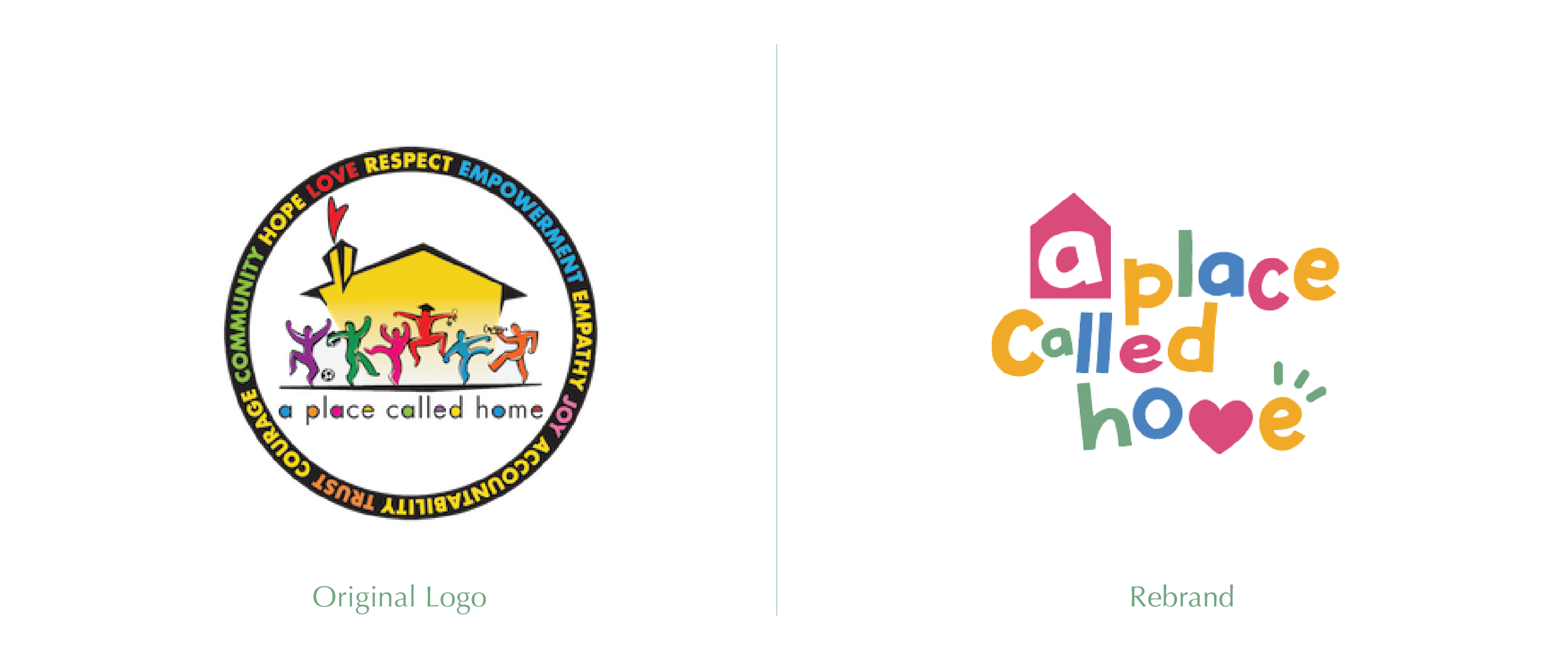
For this project, I rebranded an existing organization, A Place Called Home in Los Angeles, with the goal of better reflecting their mission and impact.
-
The organization supports kids by providing a safe space after school, along with educational programs and activities. In my approach, I wanted to highlight their strong sense of community, as well as the warmth and care they offer to the children.
-
This project taught me how to emphasize what was already there - like warmth, community, and belonging - and present it in a more direct and clean way. I wanted to showcase what the organization truly represents and reinforce that by selecting bolder typography, colors that reflect diversity and energy, and imagery that feels authentic. Together they communicate the organization's vision in a way that feels cohesive and genuine.
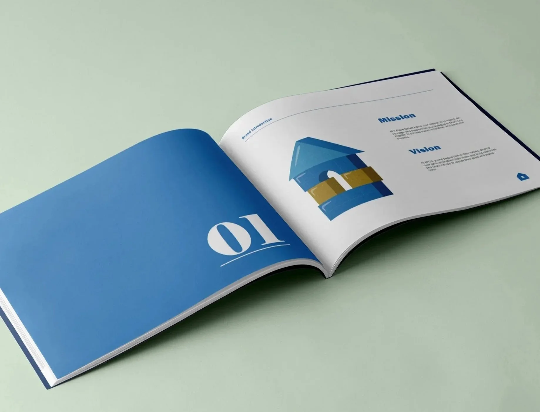

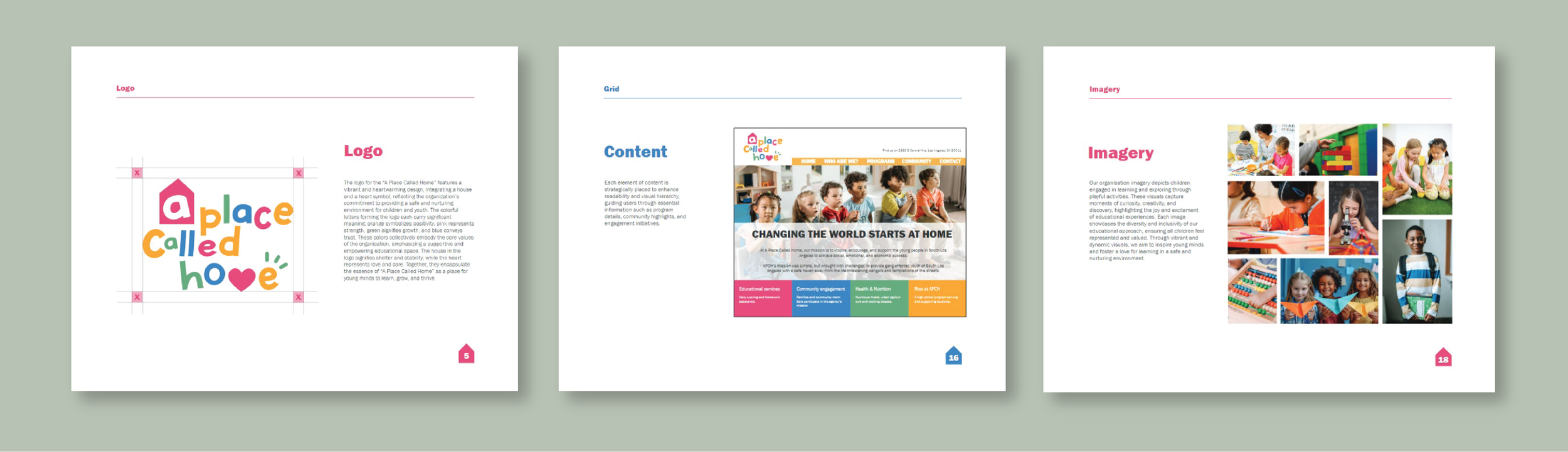
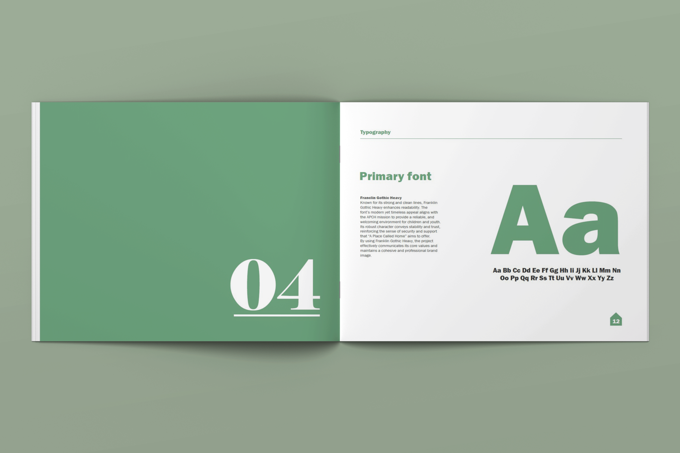
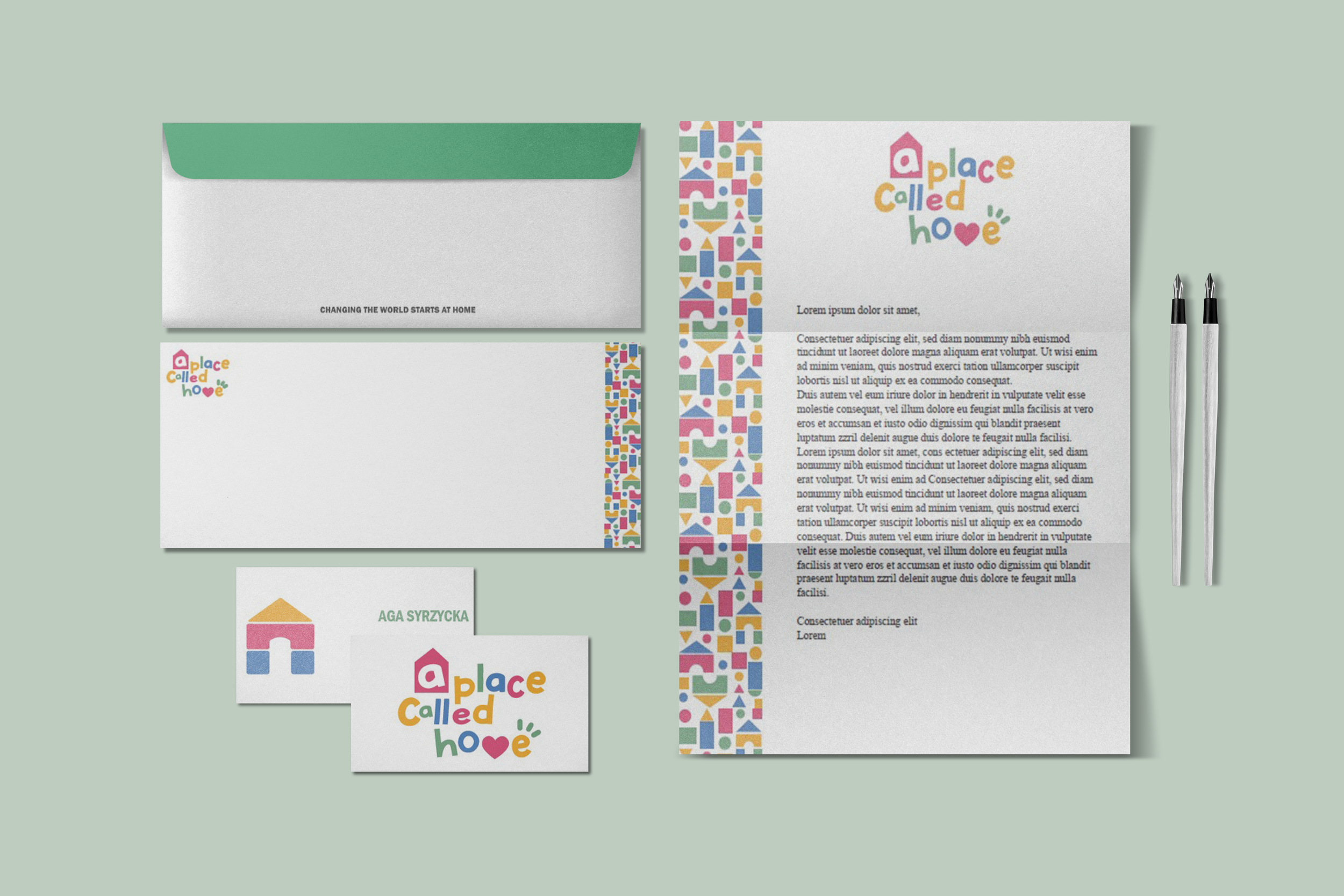
The style guide was developed to create a clear and expressive system for A Place Called Home. Franklin Gothic Heavy was chosen for its strong readability and subtle playfulness, helping reflect the organization’s approachable tone.
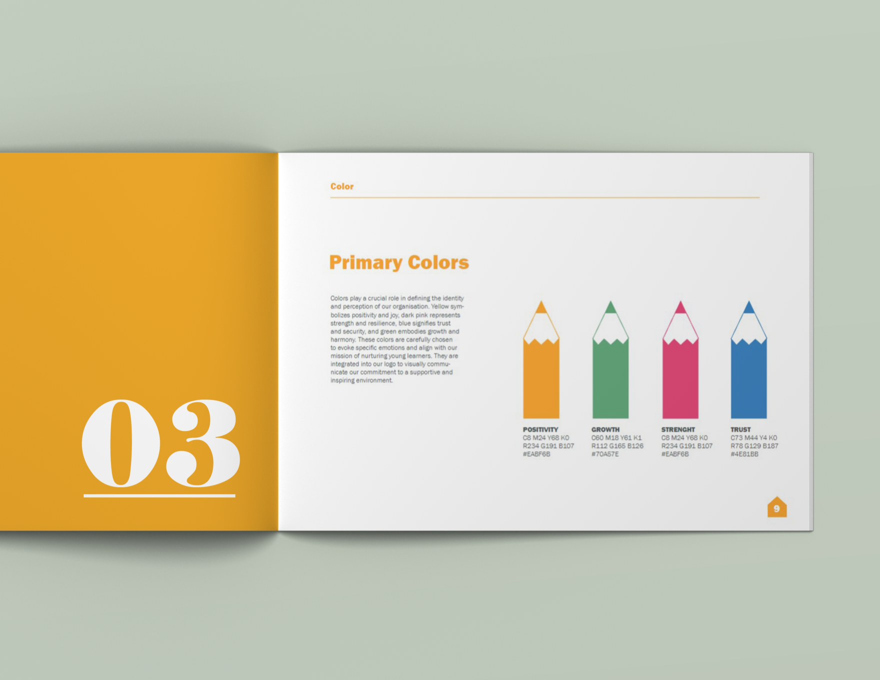
A balanced palette of four colors: orange, blue, green, and dark pink was selected to represent warmth, diversity, and energy, while ensuring visual consistency.
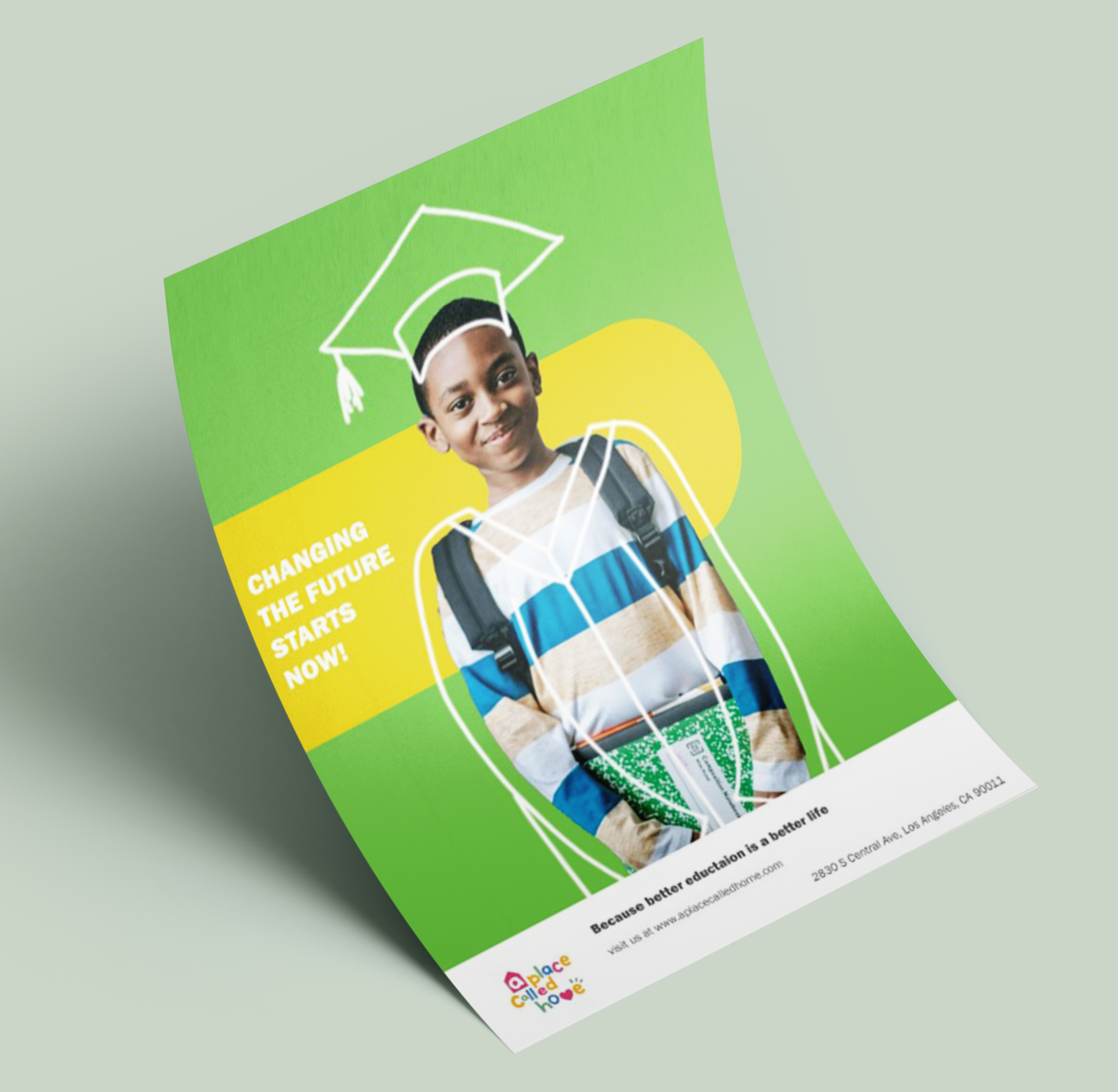
A photo direction was also defined to guide imagery toward authentic, uplifting moments within the community and suggest a cohesive look for potential website design. Overall, the system focuses on balancing structure and creativity to support a consistent and welcoming brand identity.
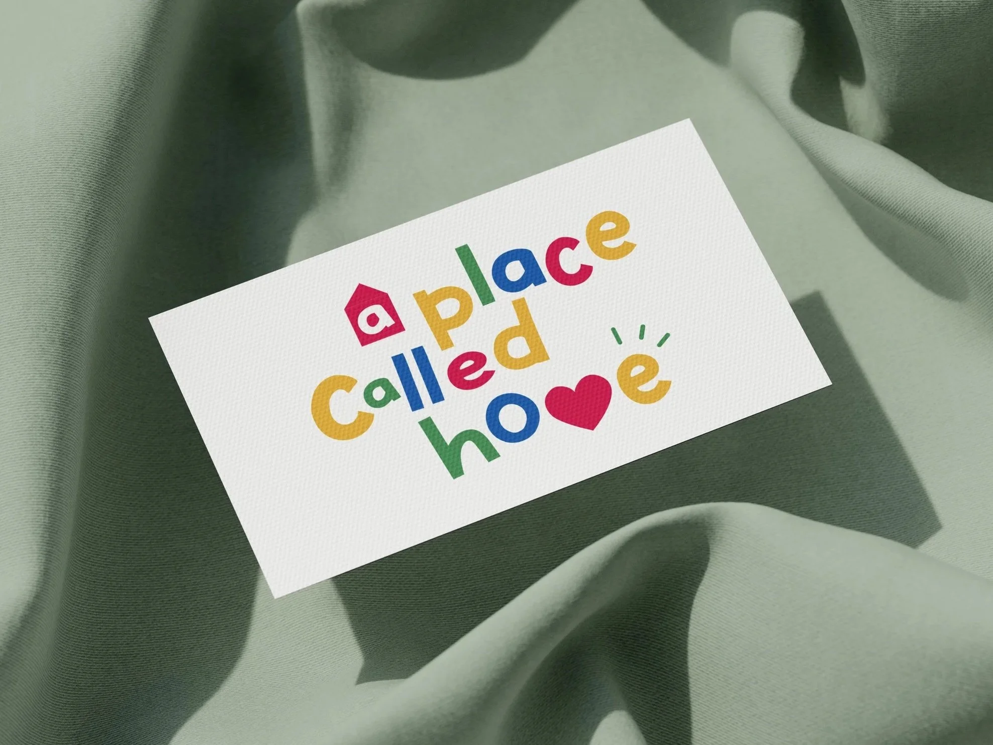
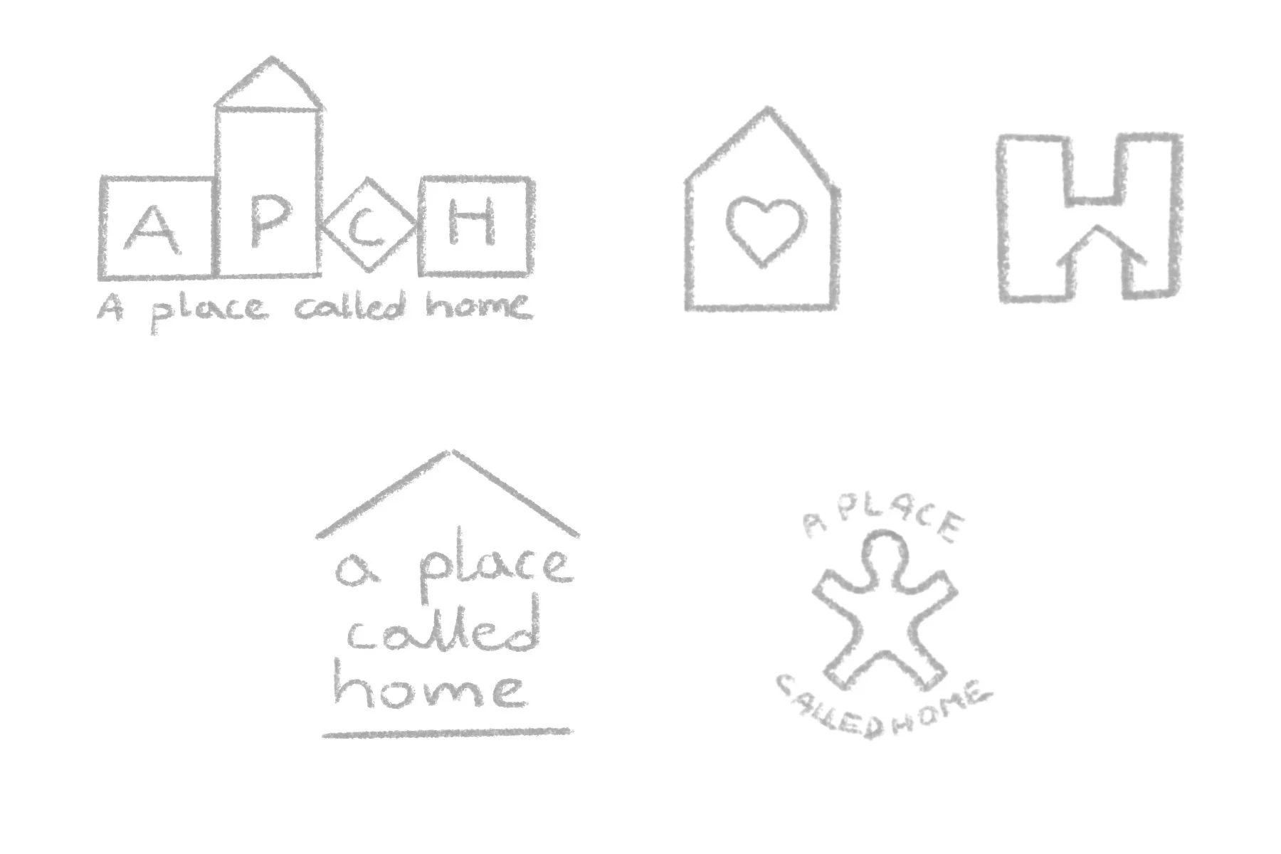
Logo Concept Development
The rebrand focuses on simplifying the identity while preserving the warmth, diversity, and sense of community that define the organization. The name itself became the central element, emphasizing the idea of belonging and reinforcing the feeling of “home” that the organization provides.

Balancing Structure and Playfulness
The style guide was created to be clean, readable, and easy to navigate, while still incorporating bright colors that reflect the warmth, energy, and playfulness of the organization.
A full rebranding project for A Place Called Home, focused on creating a warm and inviting visual identity that reflects its mission of supporting children and building a strong sense of community.