SIP Cafe
Brand Identity
-
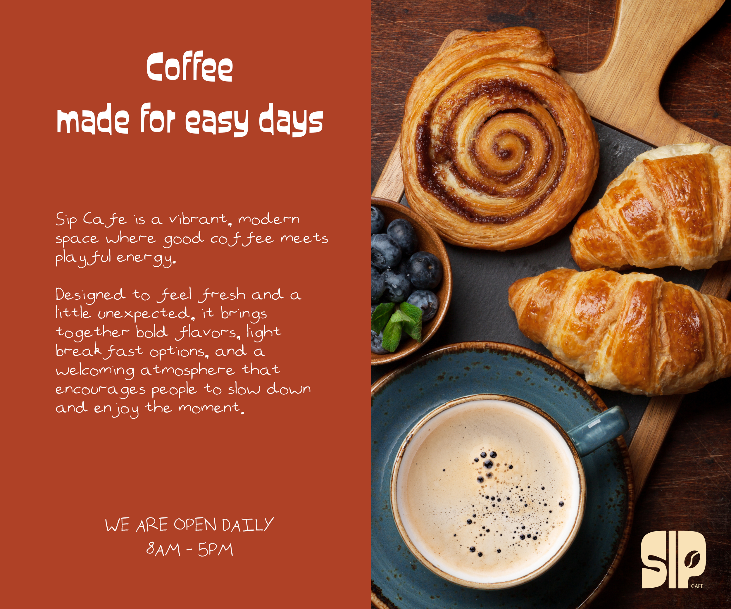
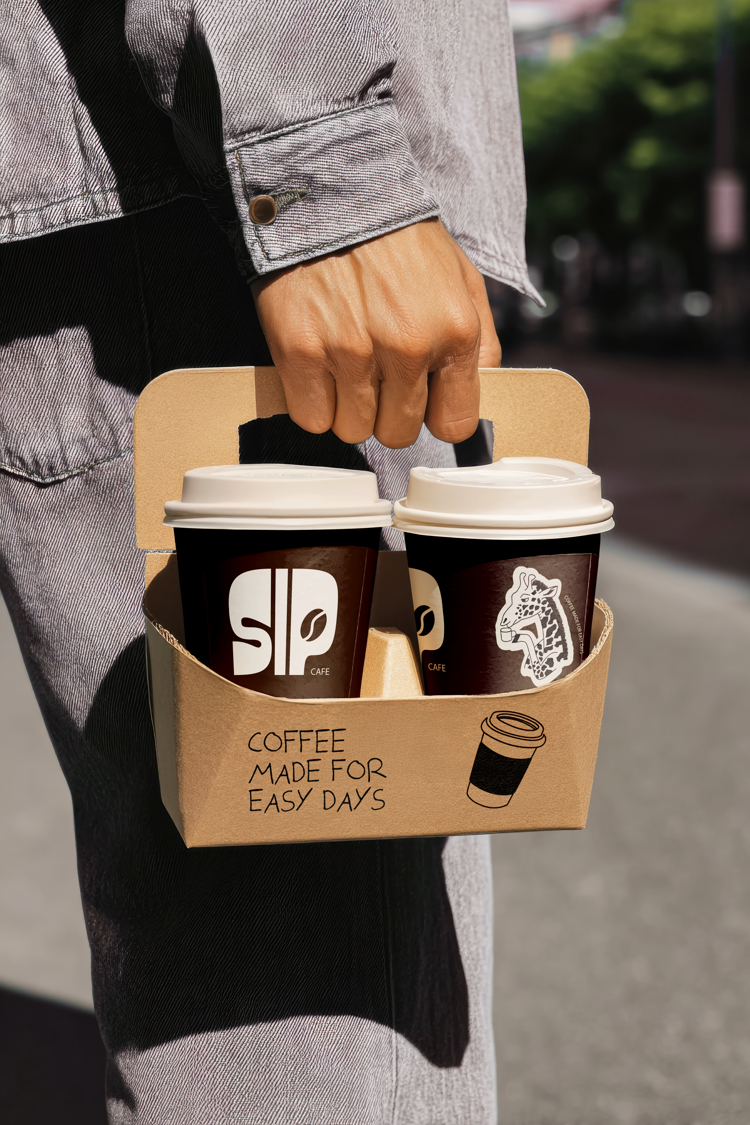
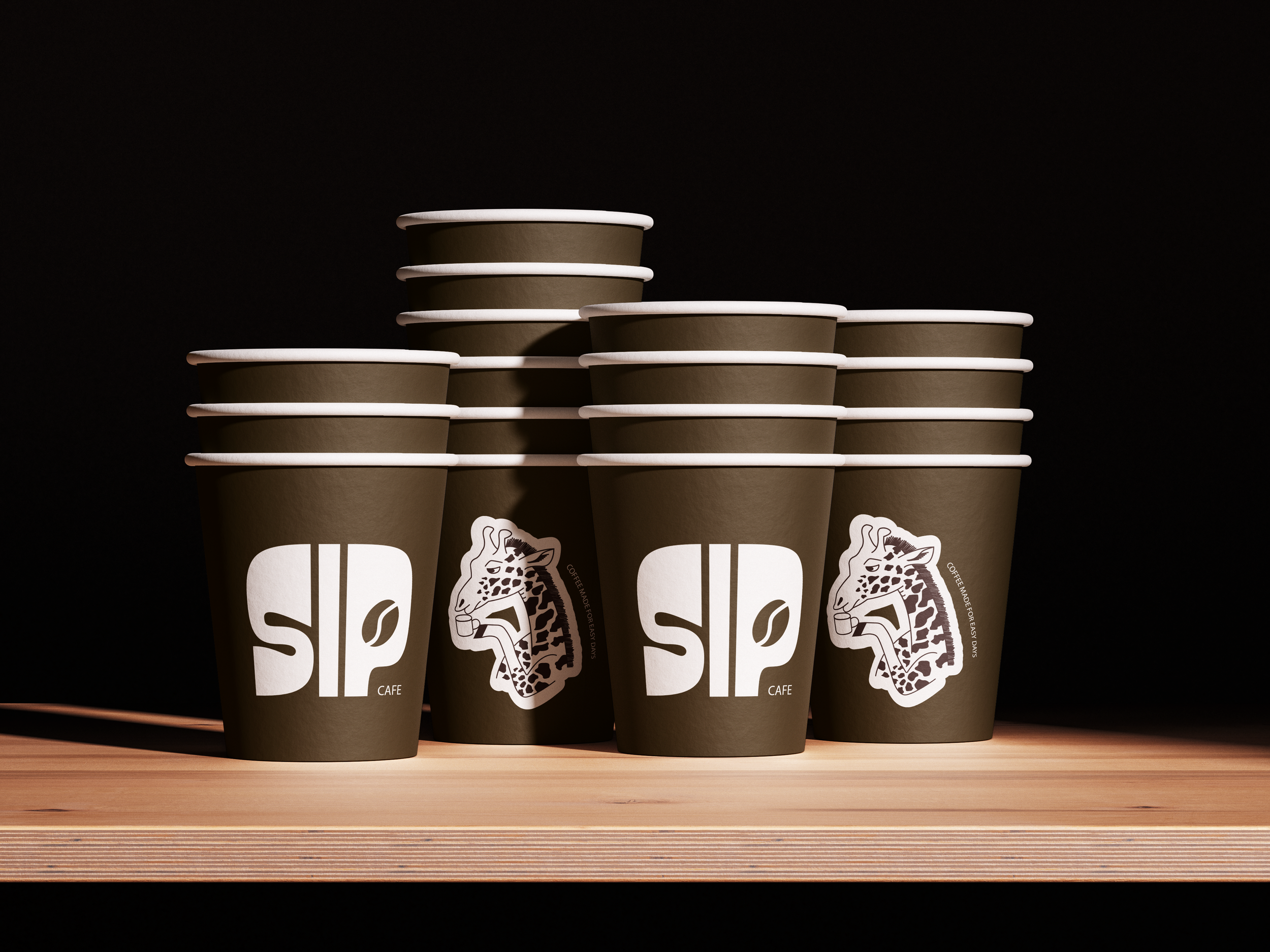
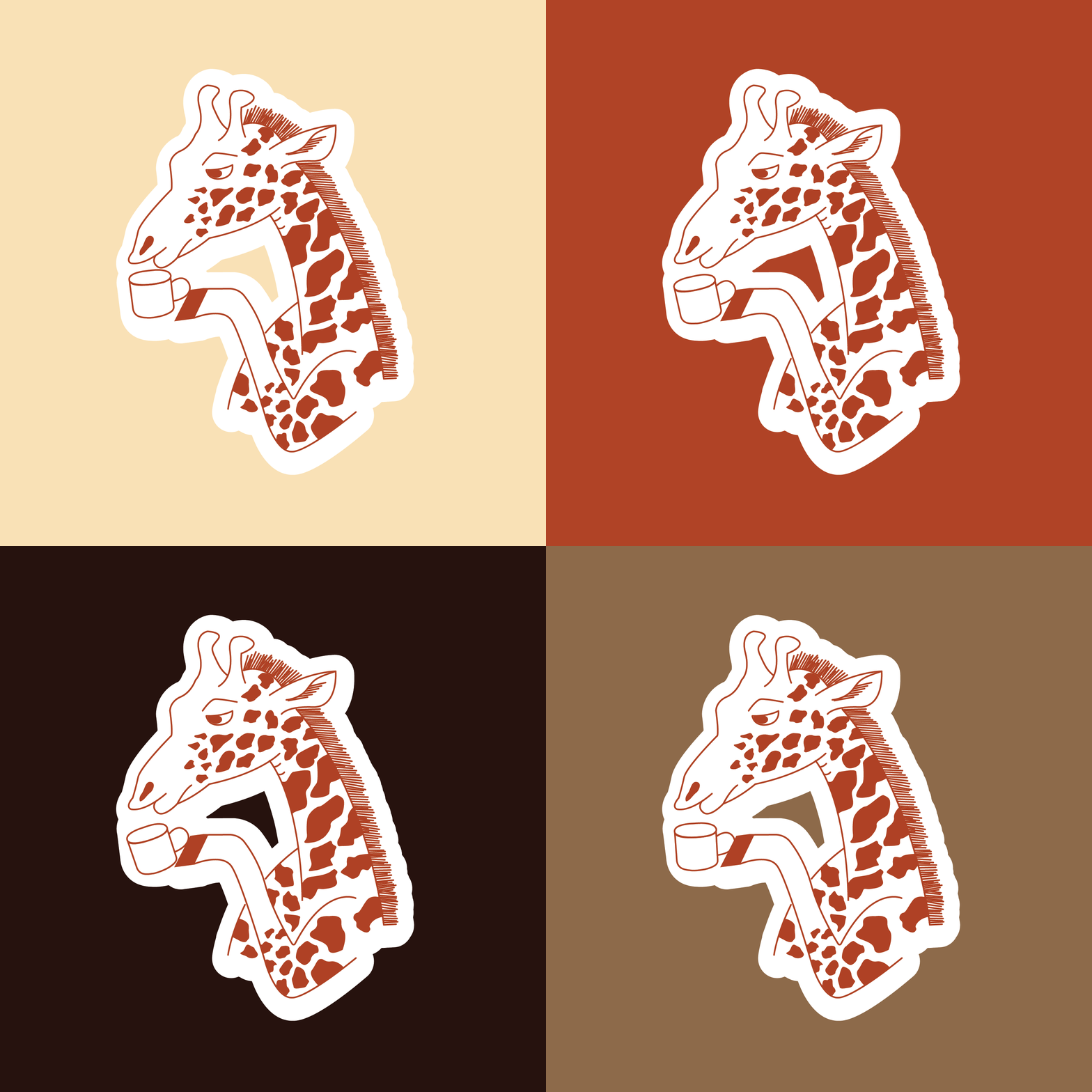
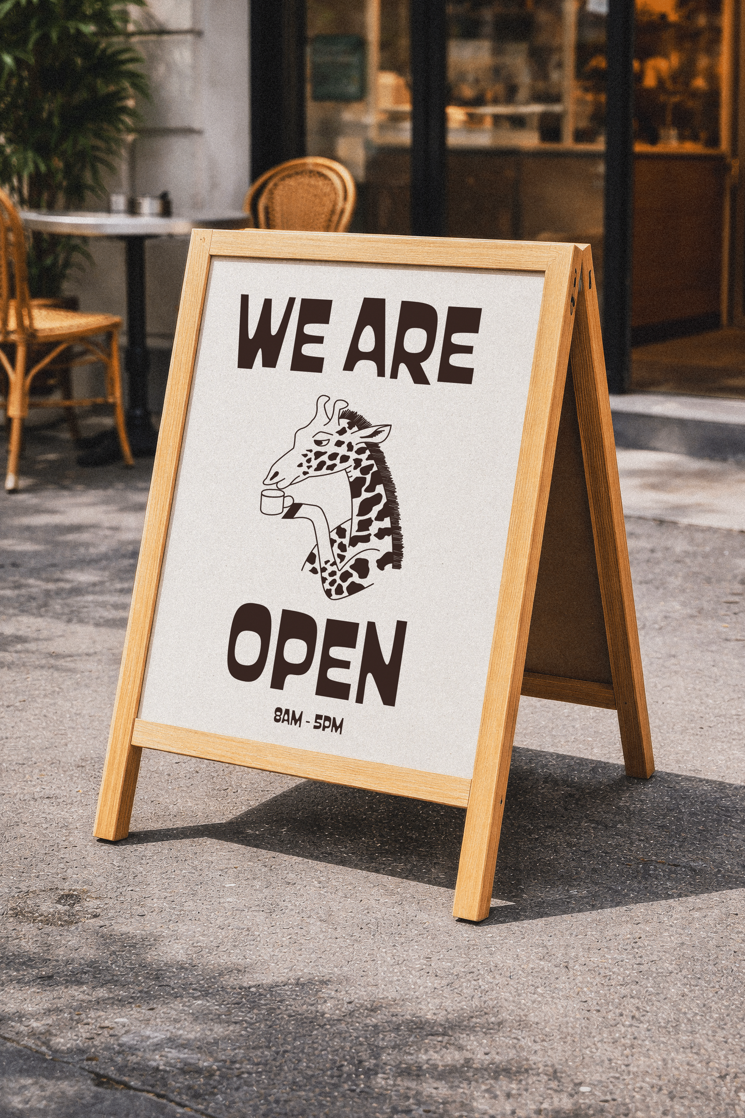
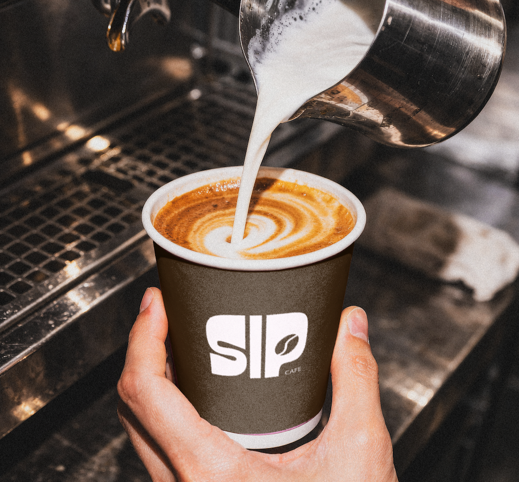
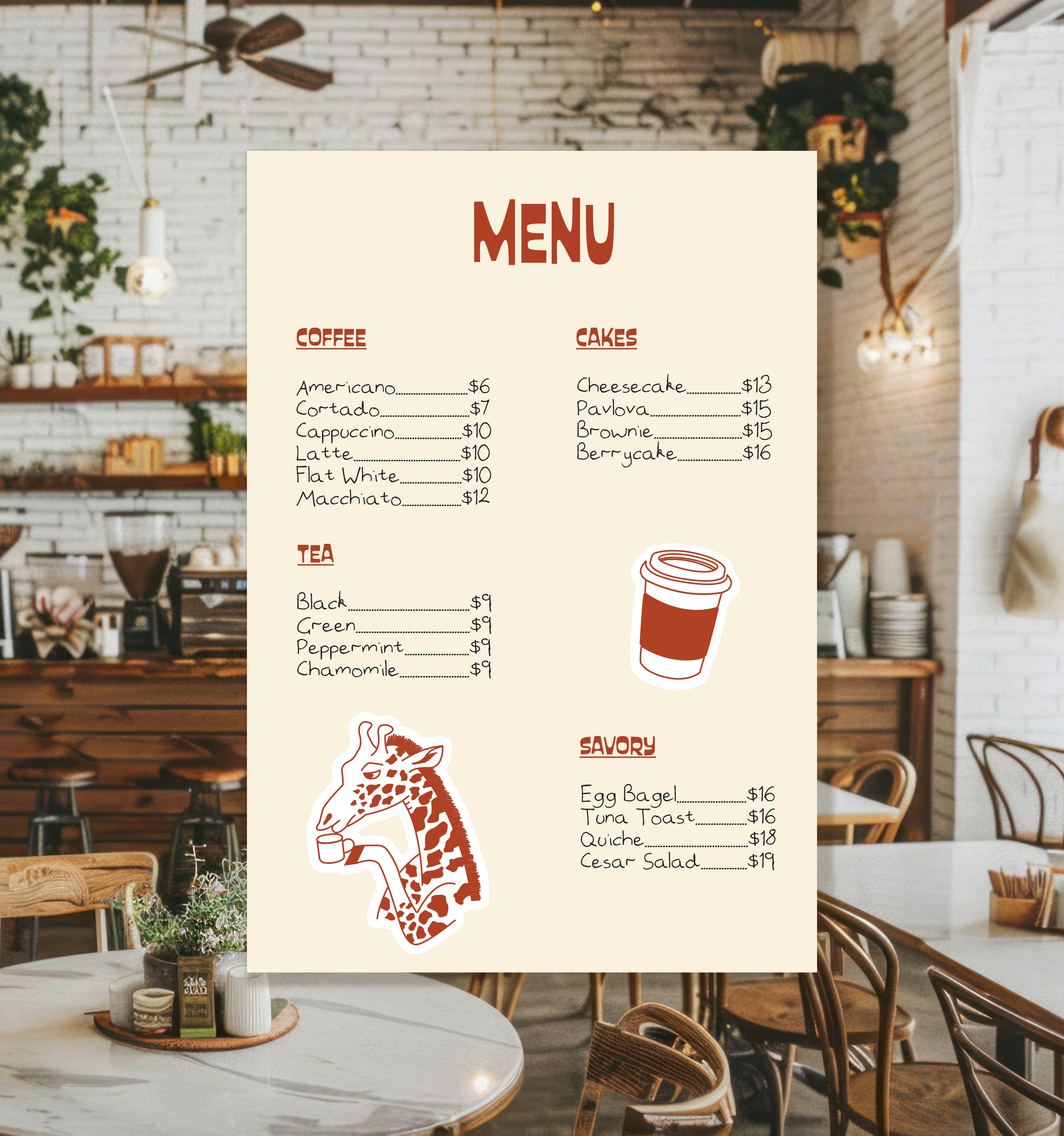
This project focuses on building a welcoming and playful identity for Sip Cafe, a modern space where people come to connect over coffee. The brand is built around warm tones of beige, brown, and brick red, creating a cozy yet energetic feel. The giraffe was chosen as the mascot to bring personality to the brand and to carry a simple story - giraffes take their time to drink, and Sip Cafe invites you to do the same.
-
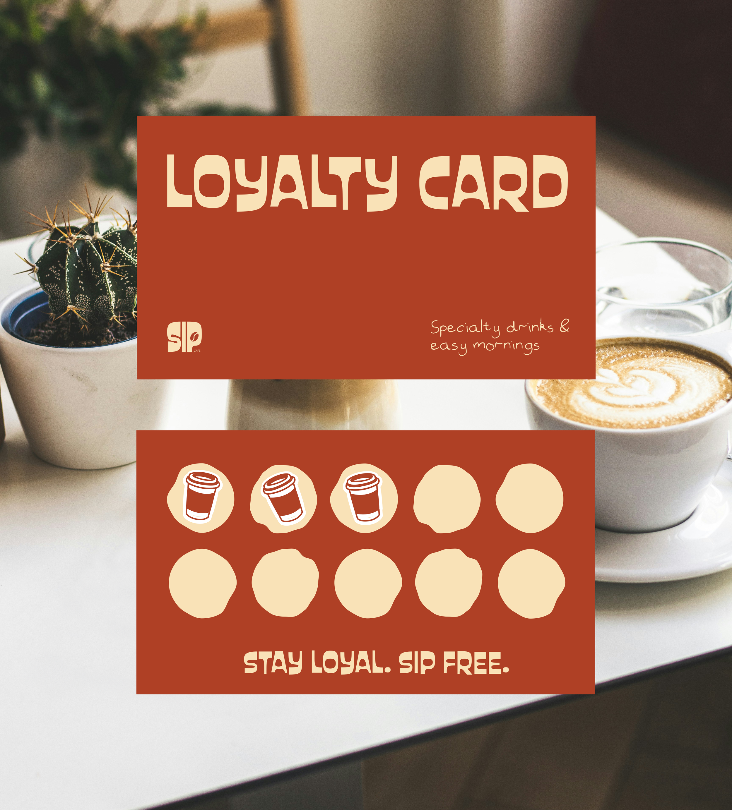
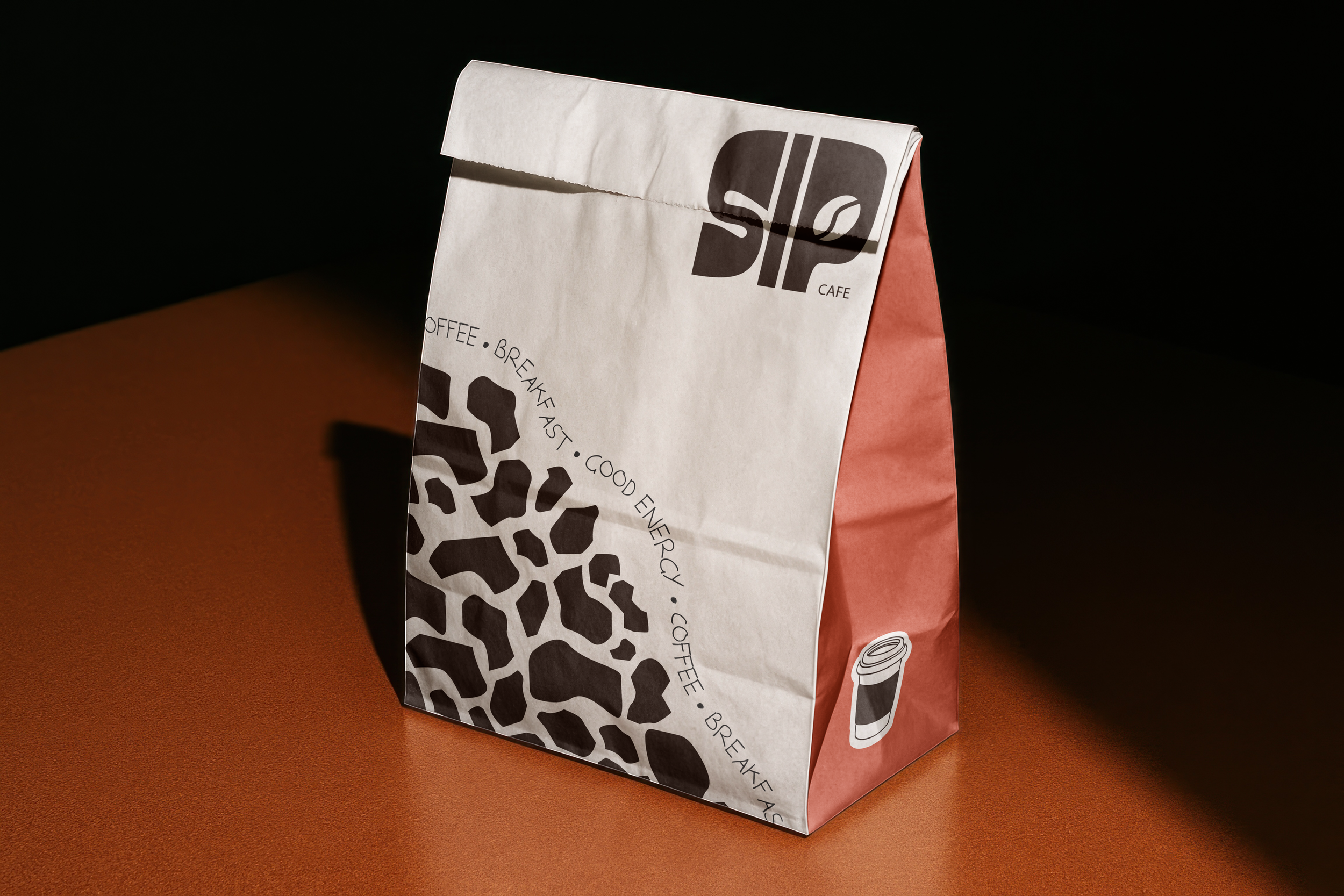
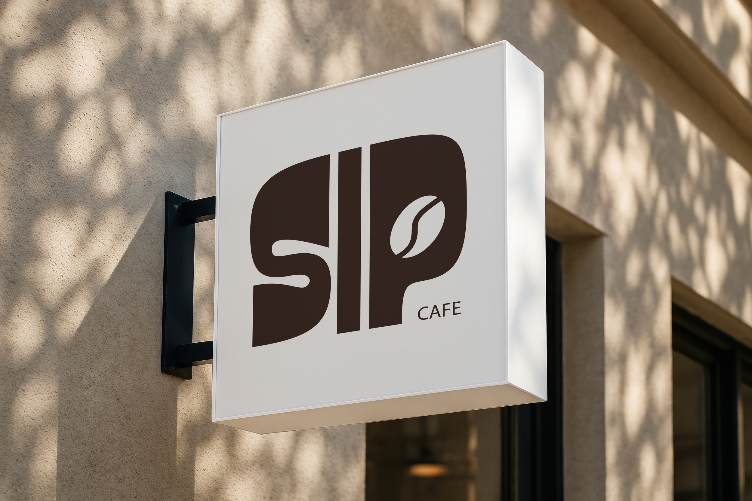
The logo centers around the word SIP in bold capital letters, with a coffee bean illustration replacing the circle in the letter P. Custard was chosen for titles for its irregular thick letterforms, while Handwrited adds a personal touch for body text. The branding was extended across takeout bags, cup holders, a menu, and a loyalty card.
-
This project taught me how all the small decisions, like a mascot, a letter detail, a font pairing, can come together to tell a consistent story. I wanted Sip Cafe to feel like a place with its own personality, and building that from scratch showed me how much character a brand can carry when every element is working in the same direction.
This project explores the branding of Sip Cafe, a modern and welcoming space.
The concept focuses on creating approachable identity that feels both playful and intentional, inviting people to connect over coffee in a relaxed, friendly environment.
Logo Concept Development
The goal for the logo was to keep it short and memorable. SIP is set in bold capital letters, with a coffee bean replacing the circle in the letter P, creating an immediate visual connection to both the name and the place. Brown was chosen for the logo to naturally reinforce the cafe setting.