Denim Club
Motion Graphics and Brand Identity
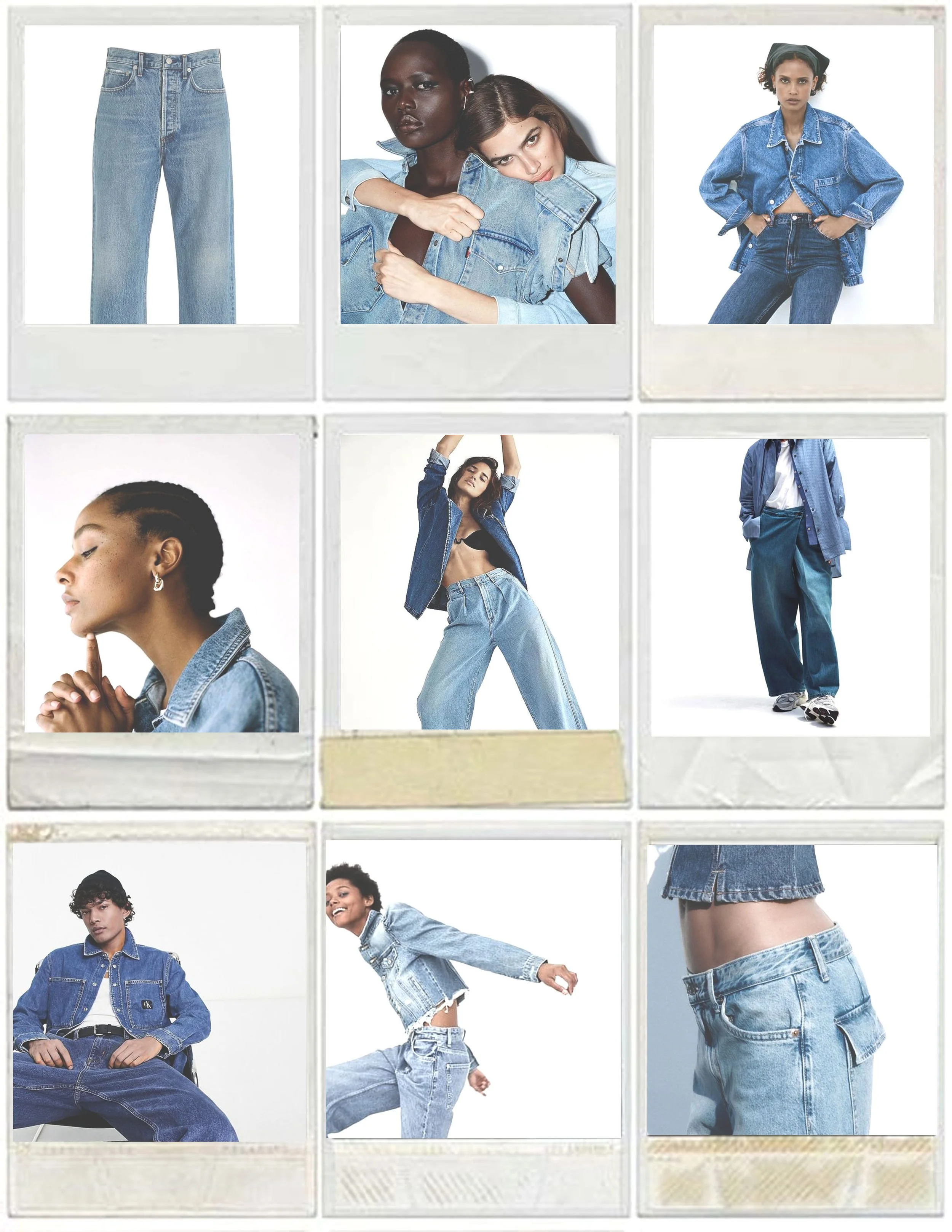
This project explores the branding of Denim Club, a modern denim company focused on comfort and everyday wear.
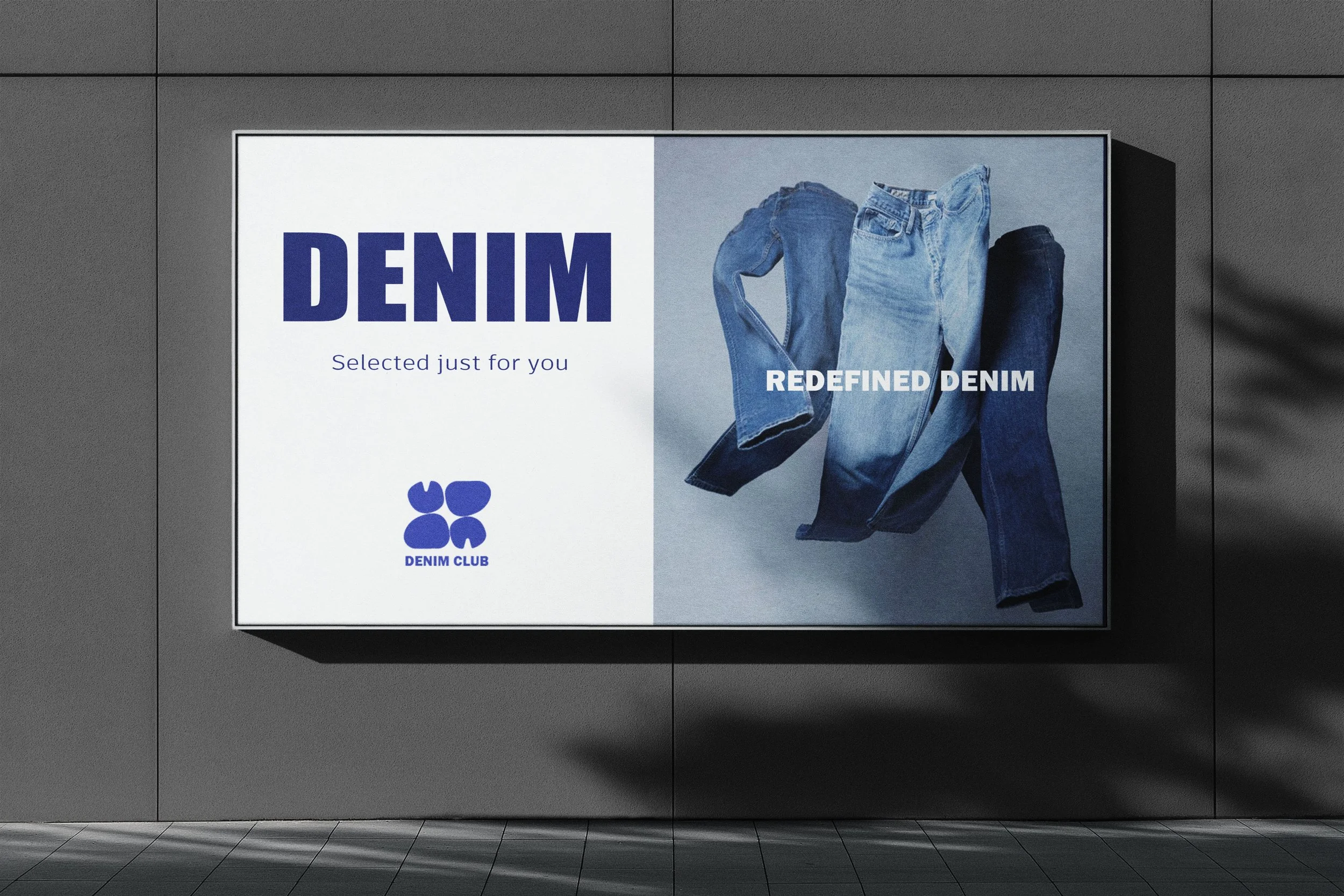
The concept focuses on creating a modern identity that feels easy, comfortable, and approachable. The brand highlights the balance between style and comfort, showing denim as something that moves with you and fits naturally into everyday life.
-
This project is a branding concept for Denim Club, a modern jeans brand focused on comfort and simplicity. The goal was to create a clean and minimal identity that reflects the everyday, effortless feel of denim.
-
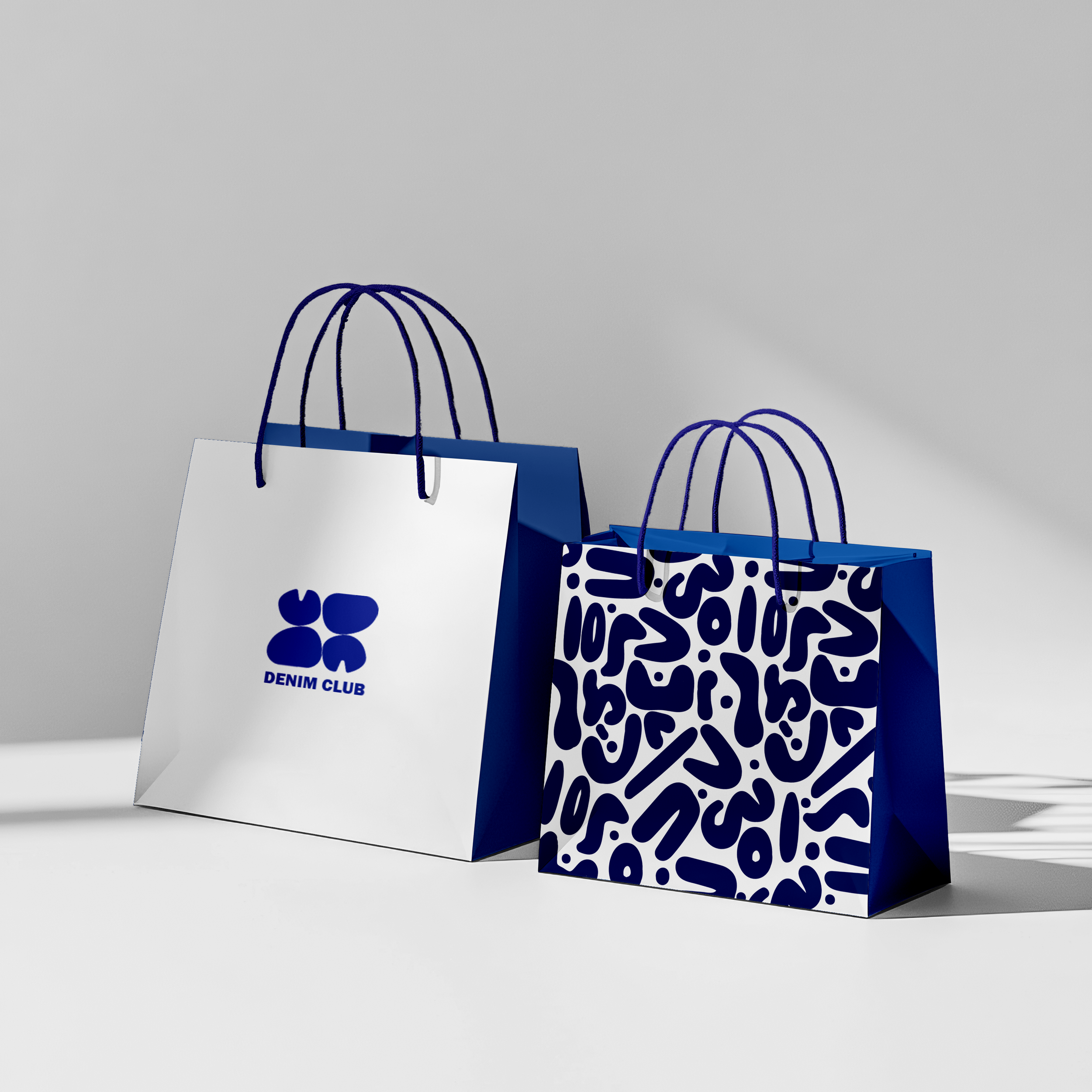
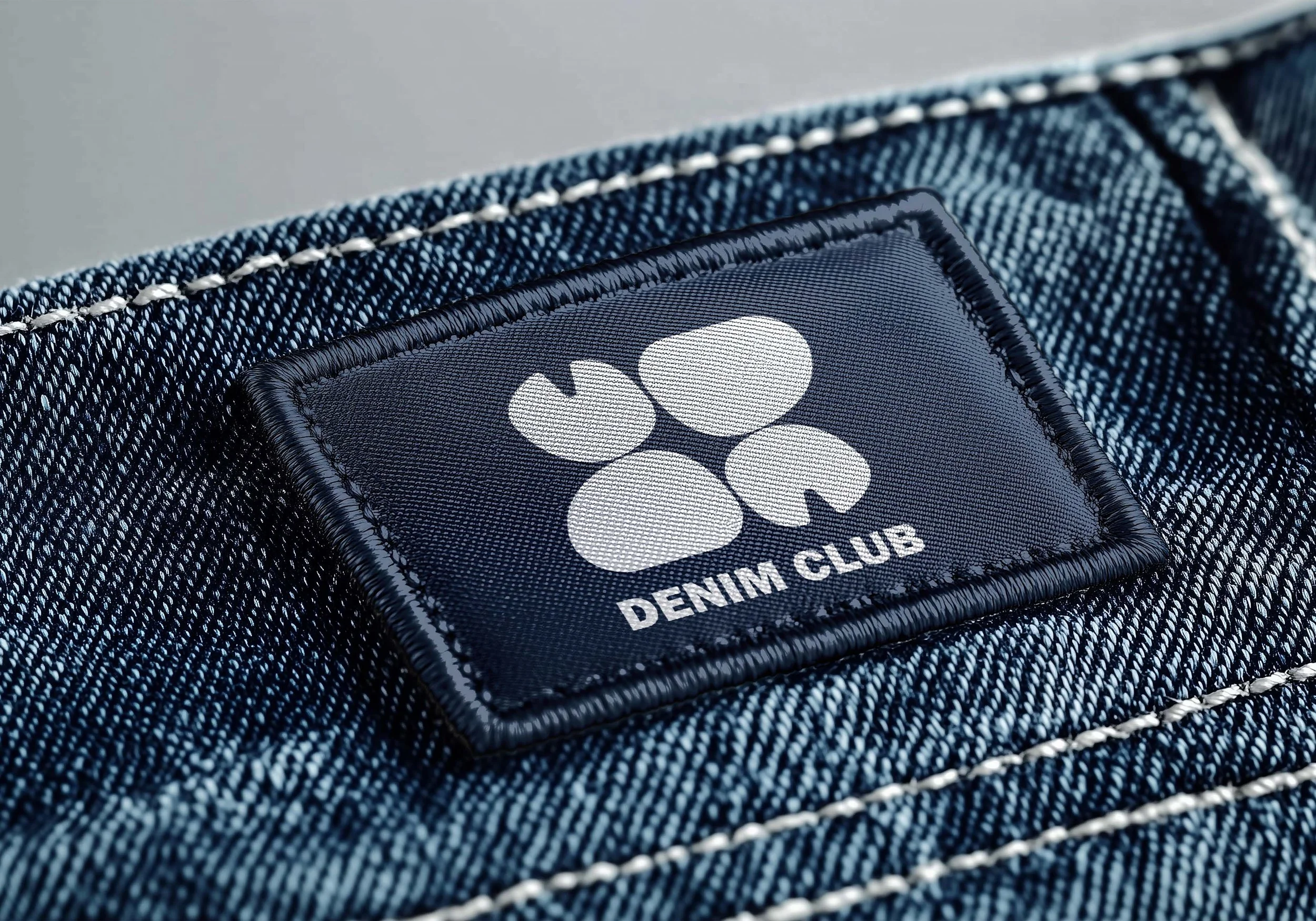
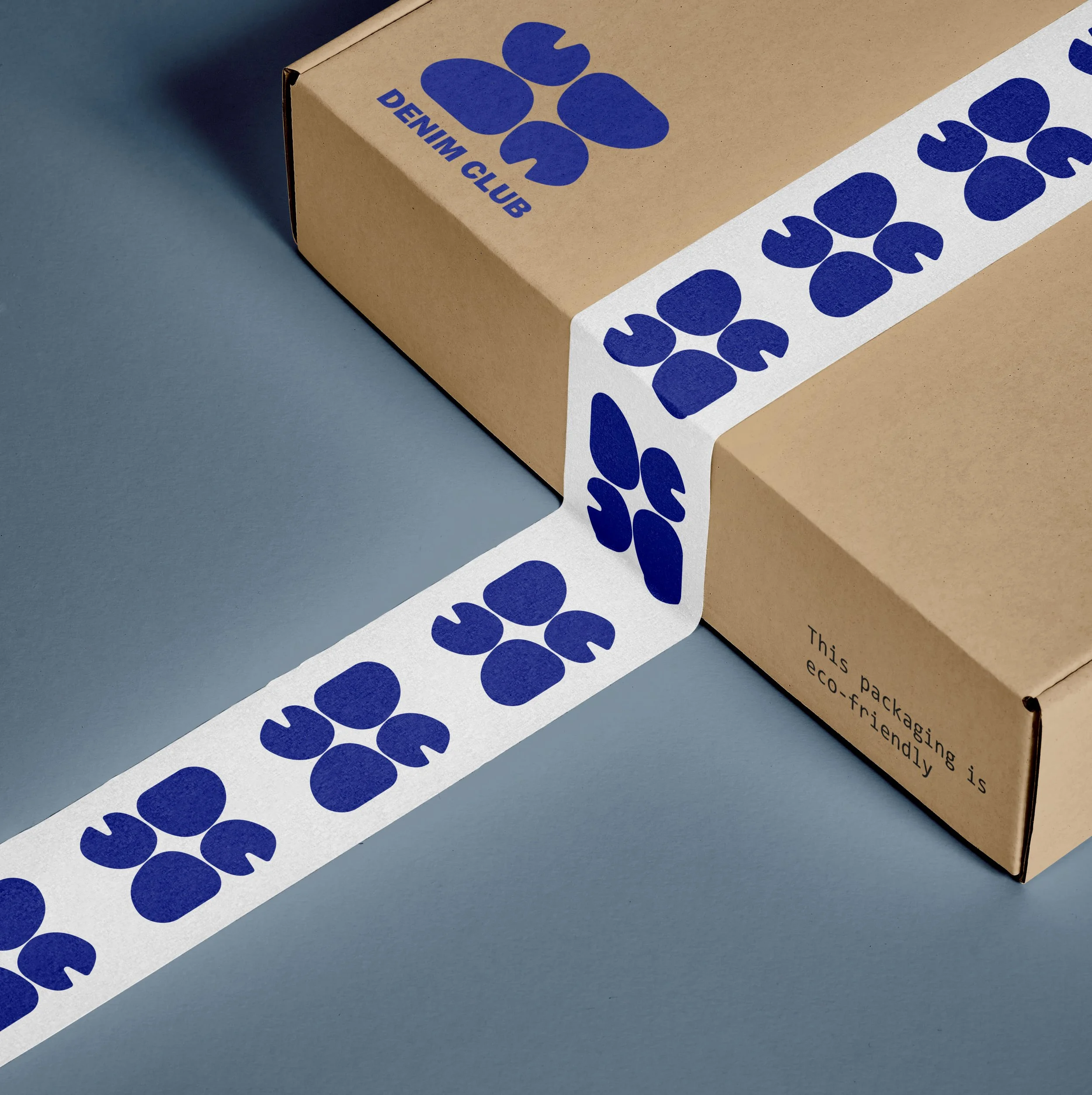
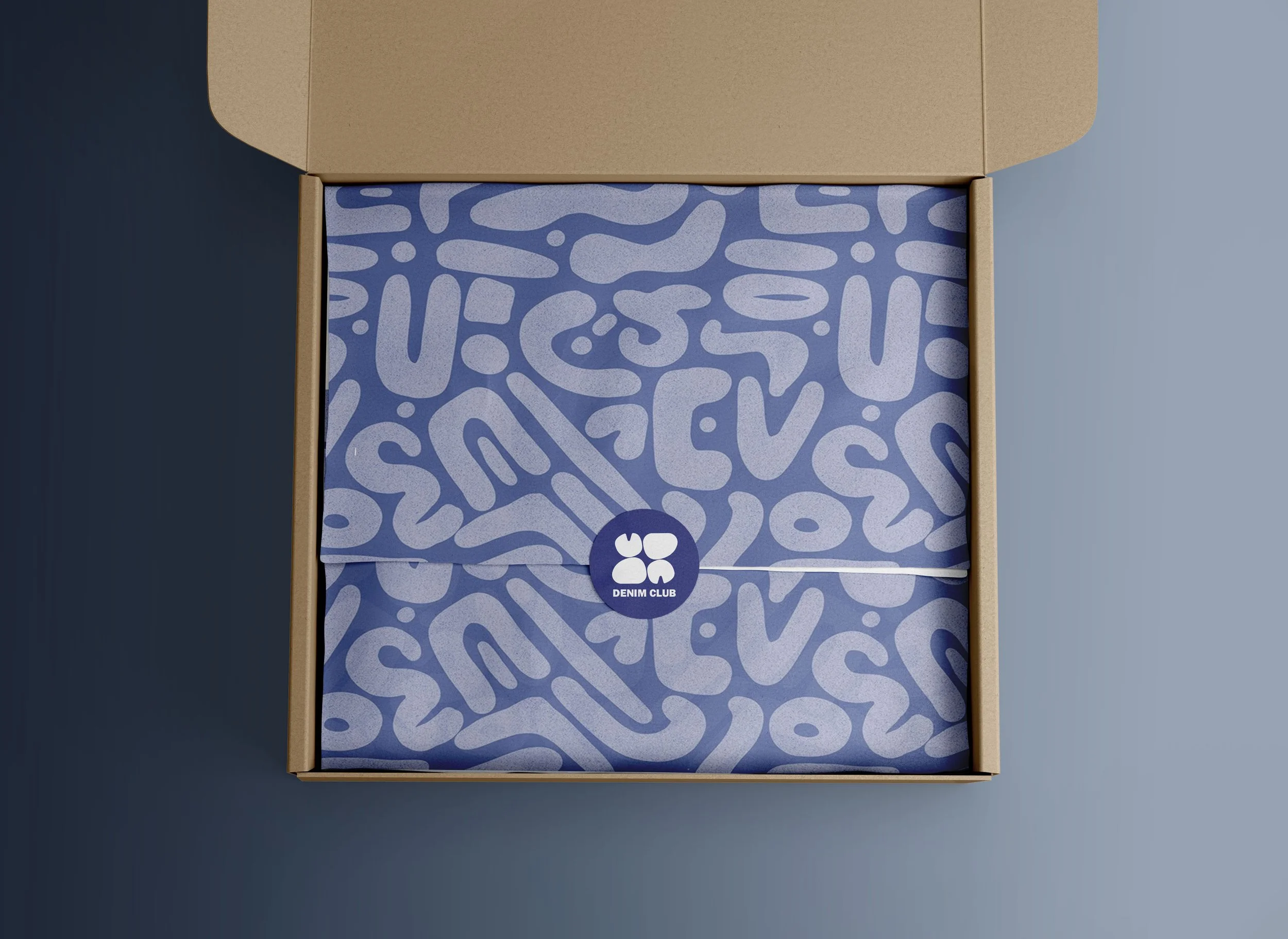
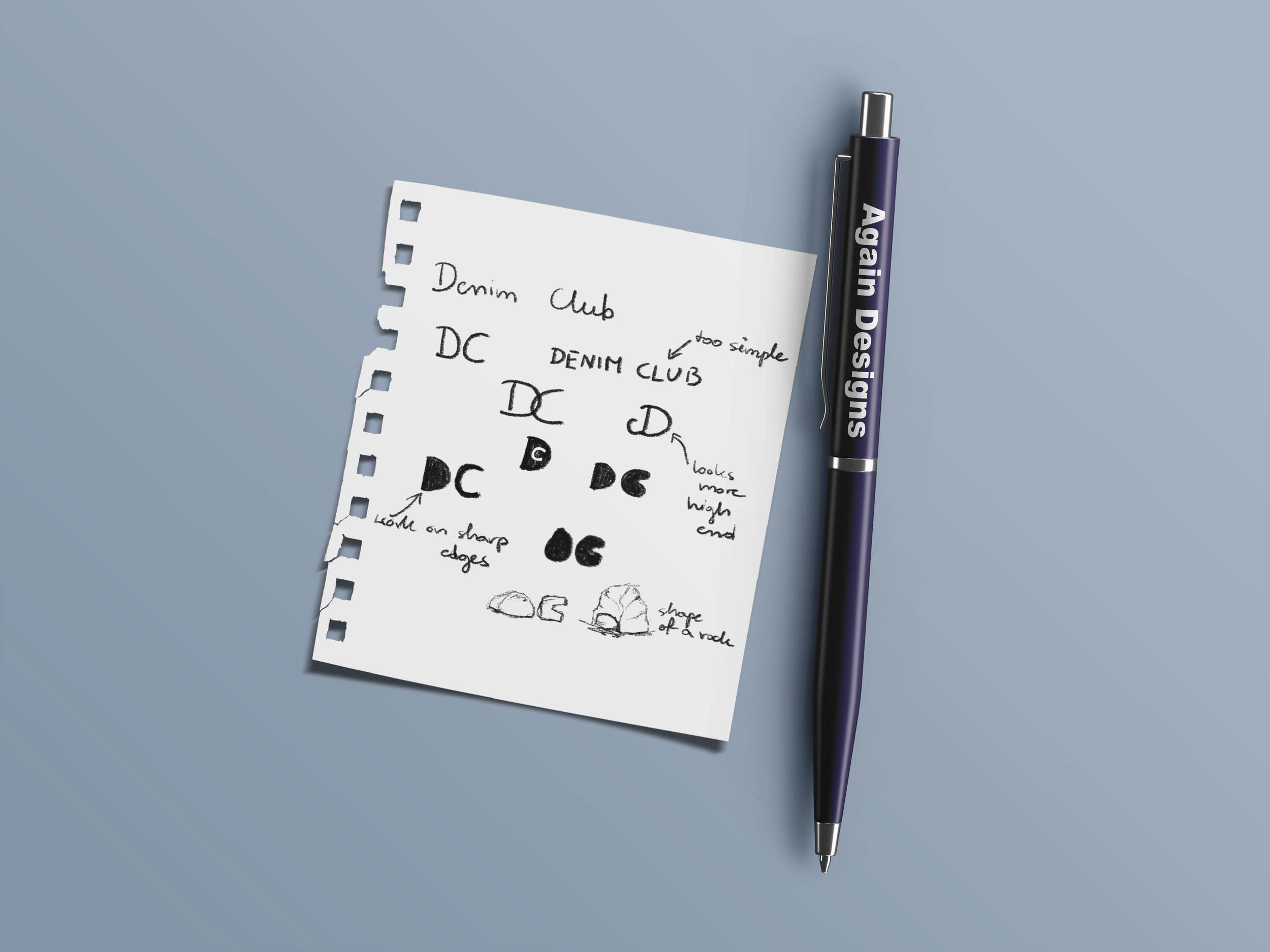
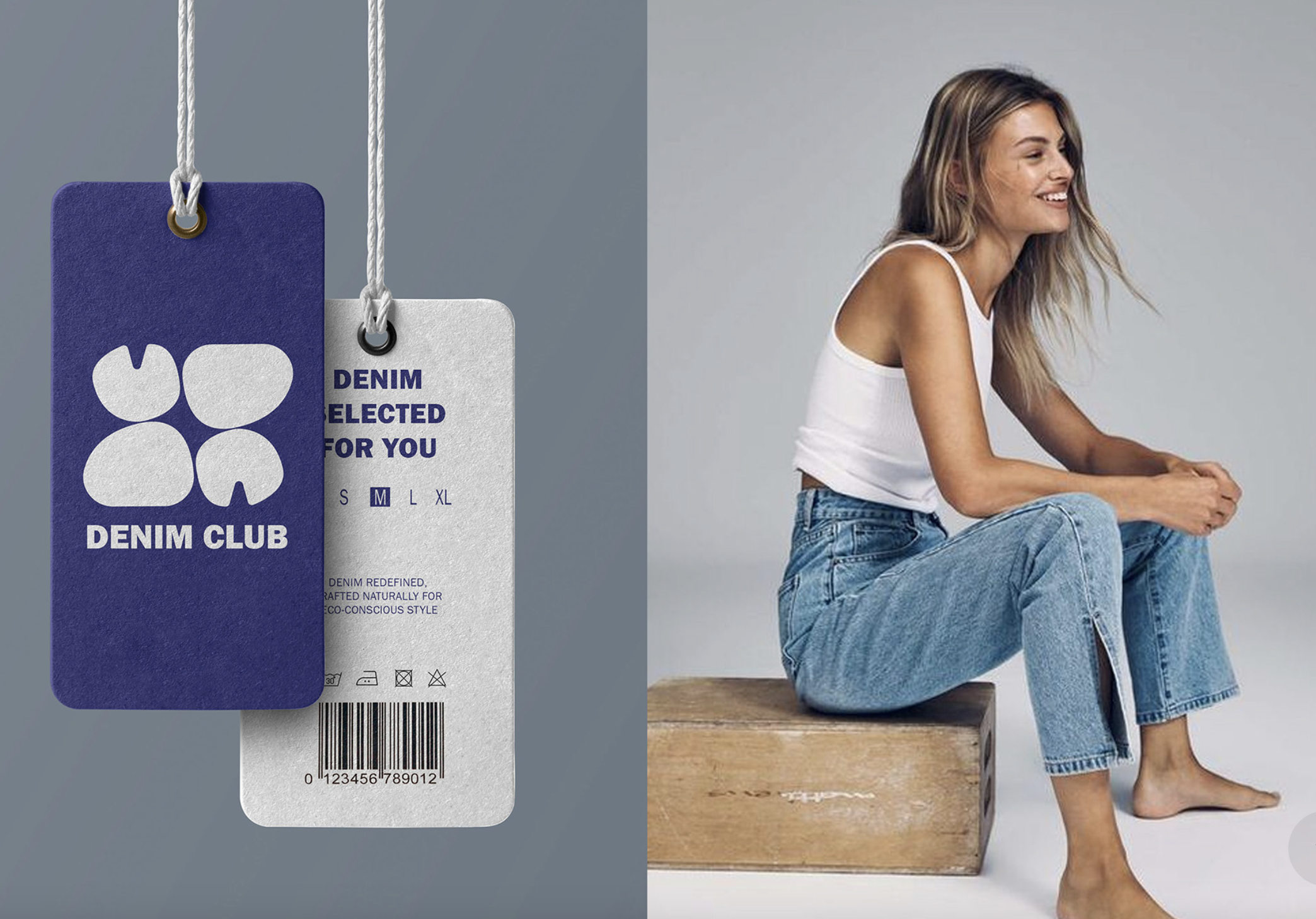
I developed a simplified logo inspired by two stone-like shapes forming the letters D and C, creating a subtle connection to natural materials and a more conscious, grounded approach. The color palette stays close to classic denim tones, using blue and knockout white to keep the brand consistent
and uncluttered.As part of the project, I also created a motion graphics campaign to bring the brand to life and explore how it could exist in a digital space.
-
I learned how to build a brand that stays consistent across different formats, especially when moving from a static identity into motion. It made me more aware of how timing, pacing, and movement can support the overall feel of a brand.
Shaping the Logo Concept
The Denim Club logo was created with the idea of making the brand feel grounded, natural, and modern. The symbol is built from simplified filled shapes forming the letters D and C, inspired by the smooth form of stones or rocks to create a subtle connection to natural materials and durability. A blue and white color palette was used to reference classic denim tones while keeping the identity clean and minimal.
Defining the Brand Direction
One of the main goals of the project was creating a clean and modern identity while still giving the brand personality. The visual direction was meant to feel effortless and confident, inspired by natural forms and a more sustainable, grounded feeling. Although the logo is built from simple shapes, the challenge was making it feel balanced and intentional rather than overly minimal.